These are the big questions that every brand manager ends up asking at a key moment: brand refresh or complete redesign? Of course, the answer depends on several factors.
To answer them requires a rigorous analysis of the reasons for undertaking such actions. All stakeholders must be considered when making this decision. It is therefore necessary to have a holistic vision of the brand and a global perspective of the impacts that result from such an operation. Each facet of the brand must be considered: the commercial brand (existing and potential customers), the corporate brand (investors and partners), the employer brand (employees and candidates) and the citizen brand (communities).
“An update of our brand identity seemed essential to support our new corporate culture and in response to the revolution in the events sector, in which the Palais des congrès de Montréal is positioned as a leader. This evolution had begun well before the pandemic, which confirms the Palais’ intuitiveness and leadership. From a visual standpoint, all elements of our identity have been maintained following several consultations with our employees and key partners, while from a strategic perspective, our new image clearly communicates our new vision.”
– Stéphanie Lepage, Communications and Marketing Director, Palais des congrès de Montréal

The logo, before and after
There are many reasons to approach this kind of challenge and to determine whether a brand needs to evolve incrementally or aggressively. Here are some reasons to make this change:
Not all brands require a complete redesign. In most cases, a refresh is sufficient. If, however, a refresh is not able to accomplish what you need, more drastic measures are in order. However, before opting for a radical “revolution” solution, thorough introspection is required to reframe the real needs of the brand.
It is very important to distinguish between corporate brands and product brands, and within the latter, brands where the product is packaged. This last case is potentially more complex since the brand directly engages the consumer in his/her most intimate habits. In the event of a change or transformation of such a brand, the loss of identity markers for the consumer is a possible consequence to be taken into account.

The logo, before and after

“For us, the decision between an evolution or a revolution rests on the research results. We appreciate BrandBourg’s approach, which allows us to always test the right options, and above all, to have convincing results.”
– Tania Goecke, VP Marketing, Bimbo Canada

The logo, before and after

End panel design stream developed for research. Current end panel design on the left.
We will consider, among other things, the strategic criteria, the costs related to this change, the performance indicators of the brand and, in the case of a product brand, consumer perception.
Let’s look at the next two elements that we believe are the most important.
Brand identity
Brand identity – which we define by the logo and other identity elements such as colour – should not be confused with brand expression, which represents all communication manifestations (advertising, social networks presence, brand content, etc.) and, for product brands, packaging.
Brand expression
Generally speaking, it is less expensive to revolutionize the brand’s expression than its identity (logo). Think of brands with many touchpoints to manage: signage, vehicle fleet, website, mobile application, etc. The company can expect to face significant investment costs. It will be even more important to invest in communication to make the reasons for this change of identity known. To indicate to the target groups a change in a brand’s expression without modifying its identity, we will use the various communication tools (advertising, social network strategies, brand content), which can play this role very well. But beware, as here again, depending on the importance of the underlying issues, we can easily encounter significant financial impacts. However, the brand identity will be kept intact. For example, the PJC logo – now almost 45 years old – has not changed since its creation, while PJC’s brand expression has evolved over the same period.
The B2B brand
A B2B brand can change its identity without costly investments, since the points of contact with the brand are more modest and often less frequent, often limited to the company’s website and a few elements of communication on social networks or in digital marketing.
However, it is important to seriously consider that this exercise is part of a timeline that will result in the two brand identities cohabiting for a good period of time, which can create confusion and harm the brand’s reputation.
The particular case of the corporate brand in B2B is based on the fundamental principle that an identity change is motivated by a change in strategy or by a desire to reposition. Thus, the new logo will have the function of clearly announcing the change desired by the company. The more important this change is, the more the new design of the brand identity must be accentuated, or even totally different.
“BrandBourg’s incredibly talented team partnered with our marketing and creative team to help build a brand strategy and identity that are both considerate of our heritage and able to take us into the next stage of our company’s growth. We are all very proud of and excited by the work.”
— Liseanne Gillham, VP Marketing, Broadsign

The logo, before and after
The product brand
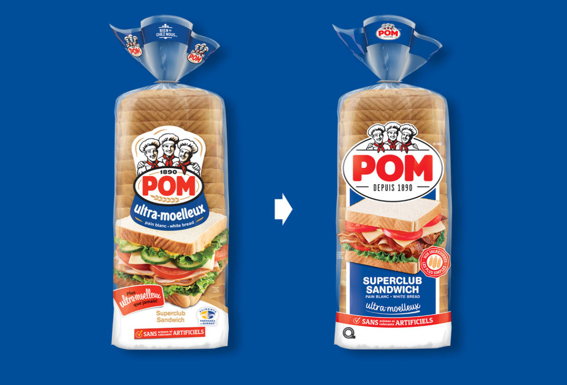
The functions of brand identity for a consumer brand are radically different than for a corporate brand. Awareness, and therefore consumer recognition of the brand identity, is dependent on its degree of evolution. A valued brand, which has existed for a long time and is consumed on a regular and frequent basis, must evolve in a subtle, gradual way (e.g., POM in Quebec and Astro in Ontario). Pepsi has changed its brand identity more than ten times in its long history (105 years). The idea is to remain relevant to the era and attract new generations of consumers to the brand.

The logo, before and after
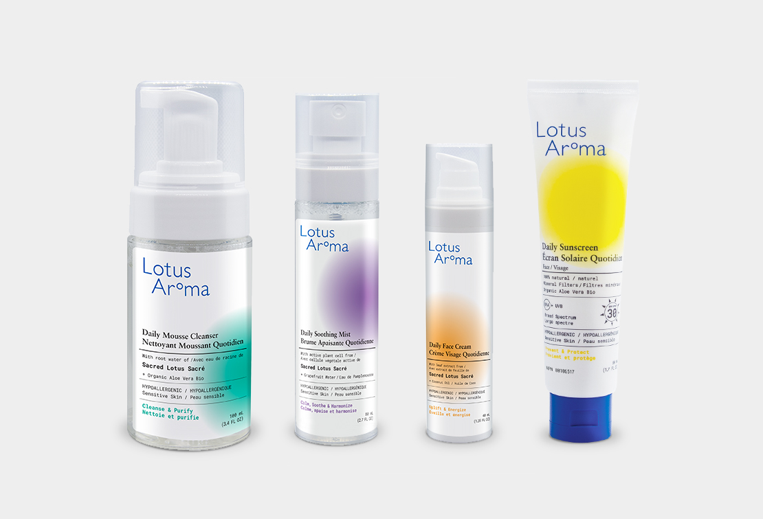
“For Lotus Aroma a revolution was necessary to pivot the brand towards our consumer in order to develop a direct relationship with them… it allowed us to regain control of the narrative.”
— Sandra Dias, Vice President, Sales and Marketing, Lotus Aroma

The logo, before and after

Evolution: the more a brand is known and appreciated, the more the option of a simple evolution is appropriate:
Revolution: this option is recommended when one or more of the different facets of the brand (commercial, corporate, employer and citizen) becomes an issue of notoriety and reputation requiring a major repositioning. It is also recommended as an opportunity, which is usually the case in a merger and acquisition situation or when the company is expanding its offering.
This is therefore indicated in order:
“Upon joining The Neuro, I noticed two issues: the confusing articulation of our institutional identity, and the need for a new logo. The existing one was dated and didn’t make the dynamic, forward-thinking impression that we wanted, especially in the digital communication space. There were functional issues as well that resulted in poor visual cohesion, and in a diluting and defocusing of the brand.
Building a brand ecosystem calls for creativity, consistency and perseverance. BrandBourg helped The Neuro achieve its brand impact goals and objectives in order to convey the cutting-edge research and quality care that are our great legacy.”
— Damien Chalaud, Senior Director of Communications, The Neuro

The logo, before and after
Lynne Gagnon, now vice-president of strategy and consulting at BrandBourg, led the development of the STM brand strategy and identity launched in 2011.
“Take the STM. In terms of brand strategy, the adoption of the environmentally focused ‘breathe’ positioning completely stood out from everything that had been done before. From an identity point of view, the only elements that were kept were the STM logo and the color blue. The typographic treatment changed from using capital letters to lowercases. A more rounded font was adopted. The famous blue arrow was replaced by yellow and green chevrons layered on top of each other, preserving the idea of movement and therefore of transportation, but emphasizing its collective aspect. In terms of communications, the break was complete. Striking a new tone and taking ownership of its own media enabled the brand to stand its ground as a citizen brand.”

The logo, before and after
Finally, the decision to rebrand in an evolutionary or a disruptive way must also be based on solid evidence. Here are the main principles to consider in order to make an informed decision:
“We were seeking support, not with a view to reinventing ourselves, but to take our process of self-examination as far as it could go, ensure consistency in our existing identity, and equip ourselves to maximize the impact of our brand. That’s what we liked about BrandBourg’s approach: taking what already exists as a starting point and working together to move forward.”
– Jean Bélanger, President and CEO, Premier Tech

The logo, before and after
Changing your brand identity is an important, even crucial decision, and must be carefully thought out. Whether it is a simple evolution or a revolution, you must base your approach on verifiable and verified criteria. This work should never be dictated by purely emotional considerations. Although we always take it to heart to reach our targets, this initiative should nonetheless be led by the head.