Brand design is now multifaceted and shape-shifting. The proliferation of various digital platforms and the growing diversity of devices and screen formats require brands to be alive and dynamic.
Brand designers have long been experimenting with different ways of creating logos that literally come to life on our screens. The graphic representation of a brand identity must quickly capture attention and convey its positioning; will it be lively or quiet, nervous or calm, depending on the values assigned to it. Designers must therefore be involved early on and take into consideration how the brand will move from the very beginning of the process – even while the brand is being thought out and defined in the strategic plan. Gone are the days when consistency of a brand identity meant following rigid and static application standards.
“The concepts of movement and animation are now core components of an identity and should be considered in the early design stages. This may consequently influence the choice of a name which uses certain characters or typefaces with real kinetic potential. The shapes used in the composition of the logo also offer different possibilities which can contribute to the innate richness of an identity. All of these considerations have guided and influenced the development of the Accessa identity.”
– Yann Mooney, Vice-president, Creative
If the advent of television brought with it the emergence of a science of animated typography for the small screen, cinema unleashed a torrent of creativity focused on movie credit design. Think of the remarkable work of designer Saul Bass for the films of Otto Preminger or Alfred Hitchcock, or the famous opening credits of Star Wars and those of the Marvel franchise. Let us also recall the paradigm-busting arrival of MTV in the early 80s with its shape-shifting signature in vibrant colours.

Nowadays, the fact that a logo adjusts to display correctly on different platforms, such as smartphones and tablets, is no longer enough. You need a visual identity that expresses a unique personality in the way it moves and comes alive. It should also have an attitude and moods to match the tone of the messages it supports. Thus, a cosmetics brand, a sports brand and a bank brand will certainly not have the same postures or the same repertoire of movements.
Product brands were among the first to take advantage of movement to give themselves a distinct personality. As an example, consider children’s cereal brands, whose characters, often friendly animals, have gone from being static elements on the packaging to animated entities that embody and tell the brand’s story and convey its personality.
“The new identity of the Palais des congrès de Montréal was designed to be in motion in order to meet the various needs of the brand’s digital displays. This colourful prism symbolizes adaptation and innovation. The logo undergoes a metamorphosis depending on the events and the themes addressed.”
– Benoit Giguère, Vice-president, Creative and Content
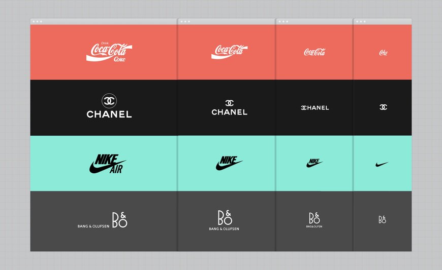
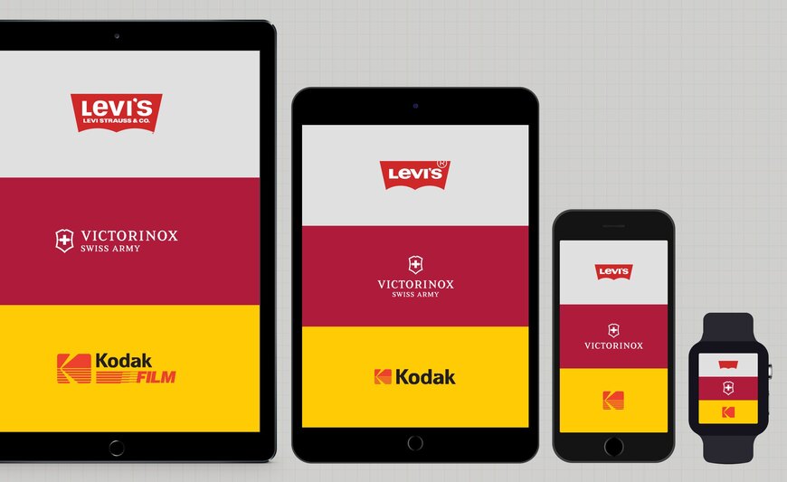
An interesting experiment by Joe Harrison, a London-based graphic designer specializing in digital design, presents brands like Nike, Coca-Cola, Chanel and Disney that have already modified their logos to better adapt to new electronic platforms. Depending on the situation, their brand image is transformed, causing some typography and graphic elements to disappear to make way for a minimal form of the brand. This allows it to better integrate with different media and various types of screens.
“Responsive Logos is a project that explores how brands might adapt for today’s multiple devices and screen resolutions. By applying responsive design principles to the various elements of a logo and stripping away the details relative to the screen size, a more readable and appropriate logo can be displayed. The concept aims to shift the brand image from fixed, rigid guidelines to a more flexible and contextual system.”
– Joe Harrison, digital designer, responsivelogos.co.uk *

Image from the site responsivelogos.co.uk

Image from the site responsivelogos.co.uk
The brand signature also plays a decisive role in the design of the brand; words too come to life with animation. They can be fast or slow, stiff or graceful, to emphasize the desired brand personality.
Though we’ve long created rigid and highly standardized logos intended to be displayed on buildings, vehicles or stationery, today’s fluidity of forms, shifts in coloration, and adaptability are the markers of a contemporary and high-performing brand identity.
See the Responsive Logos project: http://www.joeharrison.co.uk/projects/responsivelogos
Check out Stéphanie Lepage and Yann Mooney’s interview about the new identity for the Palais des congrès de Montréal :
https://www.infopresse.com/article/2020/10/27/reinventer-son-espace-et-ses-evenements