Lavery is the leading independent law firm in Quebec. Its more than 200 professionals, based in Montréal, Québec, Sherbrooke and Trois-Rivières, work every day to offer a full range of legal services to organizations doing business in Quebec.
As a well-established firm in the field of legal services for more than a century, Lavery has greatly evolved and distinguishes itself from the large traditional firms, notably with its vision as a business partner and its 360 multiservice approach aimed at propelling its clients’ growth.
To promote and strengthen its position in the market, the firm called upon BrandBourg to define and assert its brand promise and review its identity and visual expression platform.
Starting from an already solid analysis of the clientele’s needs and the competitive environment, and a very clear business vision from Lavery’s management, BrandBourg was quickly able to recommend a brand strategy that would inspire all of the project’s stakeholders. This strategy, based on an opportunity and a real desire to be bold in a rather conservative industry, guided the entire creative process, from brand identity and visual expression to key messages. BrandBourg then worked collaboratively with Lavery’s partners to develop all the elements related to the brand’s deployment: communication campaign, internal and external rollouts, and internal and external launches.
Both warm and accessible, the result of this exercise testifies to the uniqueness of the firm and its desire to break industry codes with a human and innovative approach based on personalized support.
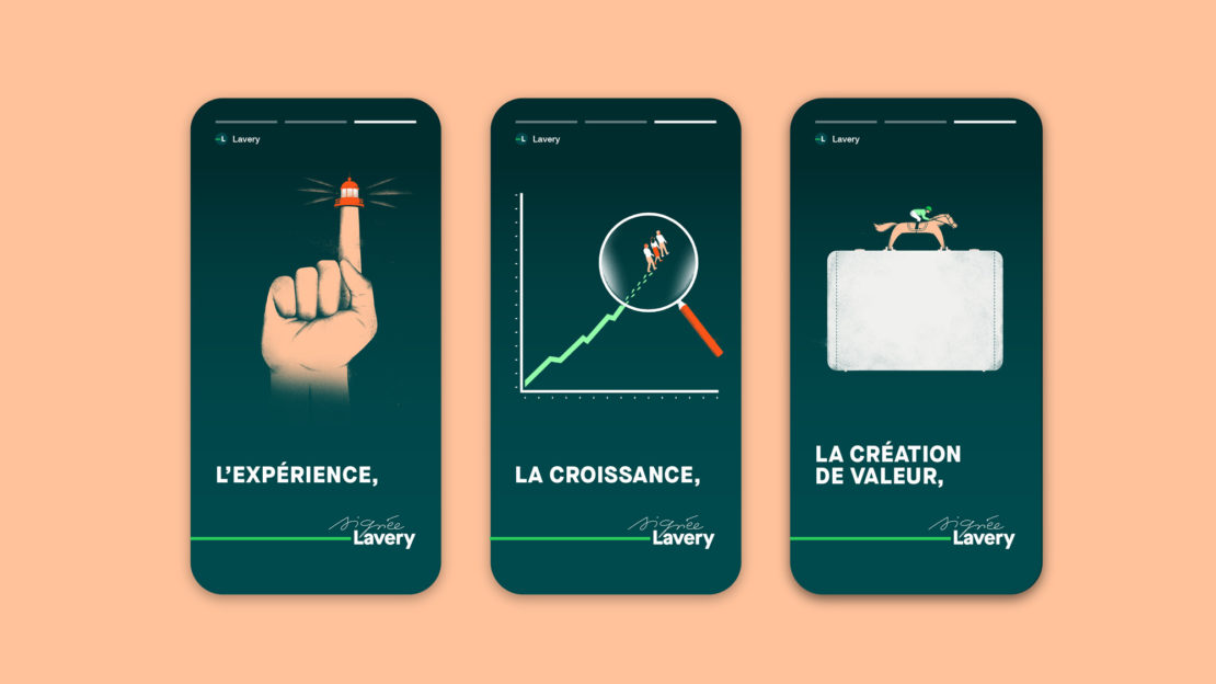
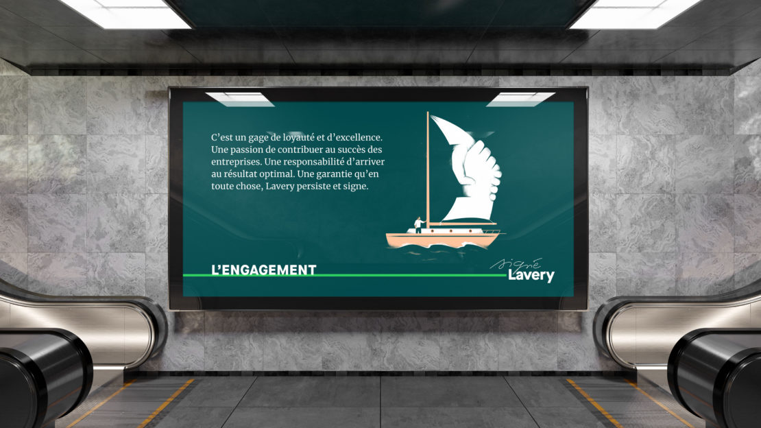
The brand image is based on commitment, experience, value creation and growth, the four main pillars that guide the actions of the firm and give meaning to each of its interventions.
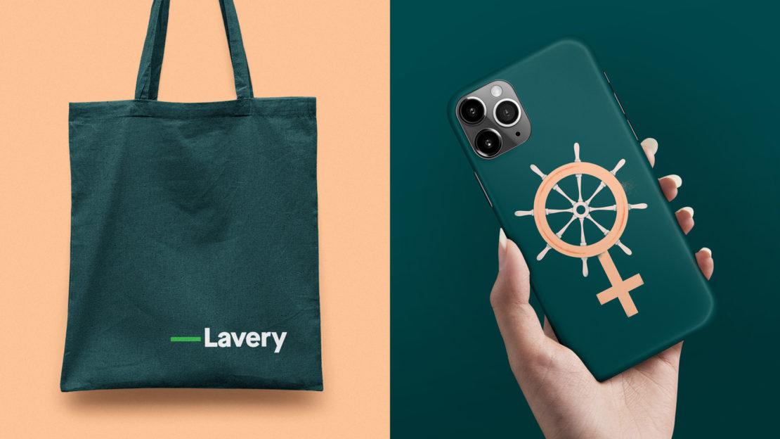
The new visual platform, created by BrandBourg in collaboration with the internal team, was designed to communicate Lavery’s mission, which focuses on partnership with its clients and its closeness to the business community. It combines its current distinctive colours with the contemporary imagery of renowned Quebec illustrator Sébastien Thibault, whose work is featured in prestigious publications such as The New York Times, The Guardian and The Economist.
Lavery’s colour palette now plays with the shades of green that already distinguish the firm in the industry. The coral colour brings contrast, originality and warmth.
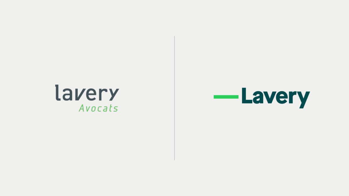
The updated logo retains the friendly, approachable feel of the brand and creates a timeless, strong character. The green line that accompanies the name Lavery recalls the line on which one affixes a signature and thus symbolizes the firm’s commitment to its clients, business partners and members of the organization.
The new handwritten signature “Signed Lavery” refers to Lavery’s human side and the personalization of its service.
Furthermore, the removal of the descriptor “Lawyers” that was a part of the previous logo reflects both the presence within the firm of a growing number of legal professionals complementary to the profession of lawyer, and the firm’s confidence in its positioning in the business community.




Anik Trudel, Chief Executive Officer, Lavery
“Our completely renewed signature reflects both what our firm is today, and what it aspires to embody even more in the coming years. We have been able to count on BrandBourg's valuable collaboration to reflect, from a strategic and identity point of view, our true nature and aspirations.”
– Anik Trudel, Chief Executive Officer, Lavery“We are reaffirming our commitment to our clients’ success, which is based on the personalized approach of a competent team, integrated into a 360° approach, and truly attentive to their needs. Our visual identity reflects the dynamism of our firm and the uniqueness of its positioning.”
– Jean-François Lévesque, Chief Operating Officer“BrandBourg's team has established itself as a true partner to our internal teams. We were able to benefit from their experience and know-how in branding, design and project management every step of the way. We are very proud of the path we have taken and the result. Our visual identity will allow us to better leverage the codes of the digital sphere, as well as offer us new options for communicating in an engaging and visual way with our target audiences, both internally and externally.”
– Joanne Lajeunesse, Director of Communications and MarketingView more related projects