Vachon® is an iconic brand of small cakes that have been enjoyed for over 100 years in Canada, especially in Quebec. As part of Bimbo Canada, Vachon® has never stopped innovating, reinventing itself and surprising generations of consumers with new cakes, collections and flavours.
In 2020, as part of a digital campaign, Vachon® asked its loyal dessert fans to vote for their two favourite Vachon® cakes. Buoyed by the popularity and success of this initiative, some fans had the crazy idea to ask Vachon® to create new unusual and hybrid products combining the best features of their favourite cakes. A challenge Vachon took on.
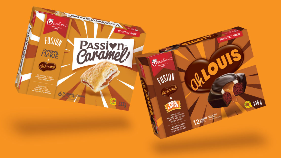
And so, Vachon® launched the development of two daring “mash-up” cakes. This is how “Ah Louis” and “Passion Caramel!” were born. The first one combined the decadence of Ah Caramel! with Jos Louis’ red velvet dough. For its part, “Passion Caramel!” combined Passion Flakie’s flaky dough with Ah Caramel!’s creamy caramel.
To help in meeting this challenge, Vachon once again called upon the experts at BrandBourg to develop the packaging designs for these two new cakes.
From a graphics point of view, it was necessary to create excitement for these new products, while preserving as many of the identity elements associated with the original products (logo, typography, etc.) as possible in order to facilitate the understanding of the “Mash-up” concept. And yet, the new packaging had to be significantly different from that of the reference cakes to avoid any risk of confusion for consumers once everything was merchandised side by side in stores.
To ensure that the mash-up was clearly communicated, and to highlight the appeal of the proposition, as well as the differentiation of the packaging, every aspect of the graphic development was validated through rigorous consumer research across Canada.
To enable quick identification of the flavours of the two new cakes, each mash-up used a distinct colour palette on its packaging.
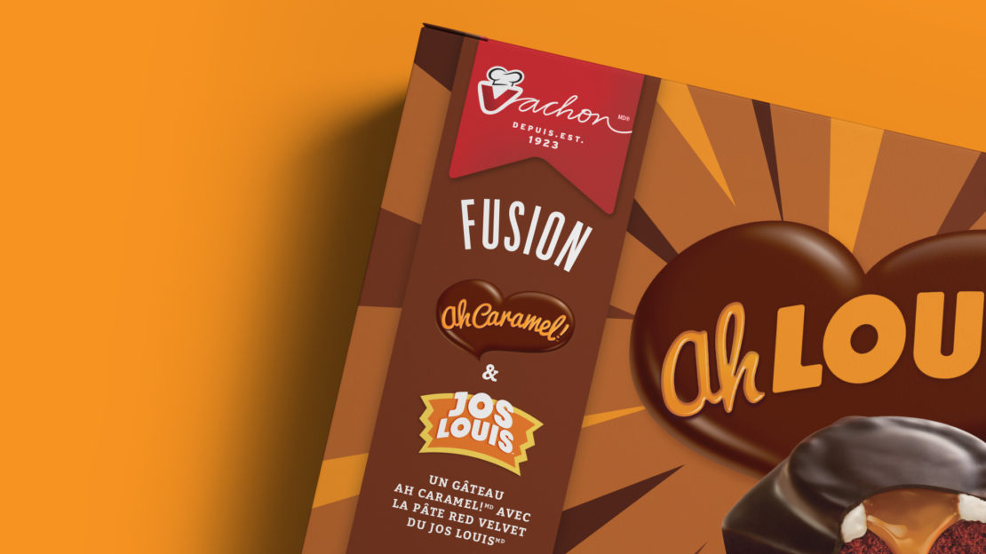
On one hand, the “Ah Louis” background, mostly in shades of brown and orange, recalled chocolate and caramel as well as the emblematic colour of the typography found in the classic Ah Caramel! logo. For its part, Passion Caramel! combined colours reminding us of puff pastry, cream and the decadence of caramel.
As for the logos on the new packaging, the intention was to maintain a strong link with the classic cake logo with the closest resemblance to each of the new products. Consequently, the iconic Ah Caramel! heart was preserved for “Ah Louis”, and the iconic Passion Flakie typography was used for “Passion Caramel!”.
To highlight the concept of a mash-up of two existing cakes and to emphasize the unique characteristics of each, an explanatory strip, positioned on the left side of the packaging, showcased the main elements of the product proposition.
As well, the product display, combined with the use of the names “Ah Louis” and “Passion Caramel!”, clearly captured the long-awaited mash-up.
We are convinced that this innovative and decadent initiative has pleased consumers and surprised even the most loyal among them. The new Mash-up cakes are now available across the country!
Enjoy!
"From a packaging standpoint, the bold Mash-up cakes project needed to combine novelty and nostalgia - be visually appealing and contrasting - while preserving the recognition elements of existing favourites. BrandBourg was able to guide us through all phases of the development of the new packaging. Adding a consumer research component to the creative process allowed us to validate the relevance of the visual concept and to optimize the communication elements on the packaging. Their guidance helped us achieve a creative, effective solution that respects the brand's heritage. We are thrilled with the final look and the impact in store."
Annick Rousseau - Marketing Manager at Bimbo CanadaShare to your social media
View more related projects
 Back
Back