BLACK DIAMOND® cheese has been a staple in Canadian homes for almost 90 years. Canadians have grown to trust BLACK DIAMOND® for delicious, high quality cheese. The brand comes by it honestly, having stayed true to its roots with a strong respect for traditions. To this day, BLACK DIAMOND® cheese is made with the same level of detail and care as it was done decades ago. In this way, BLACK DIAMOND® is a truly authentic brand.
This same level of respect for attributes BLACK DIAMOND® has built over time is the same approach BrandBourg adopts in any creative work for the brand. As brand stewards, BrandBourg’s responsibility is to continually strengthen the brand’s visibility and competitive impact through a mindful evolution of its visual assets.

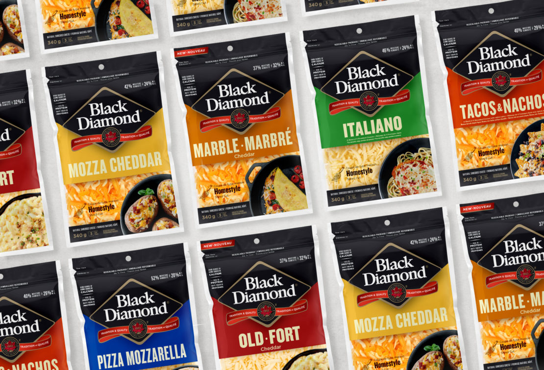
Black Diamond® shredded cheese packaging had not been updated for a number of years and was in need of a refresh. Triggered by an update to its product lineup, the revitalization of BLACK DIAMOND® shredded cheese packaging presented the challenge of improving on current packaging metrics and accelerating growth. This was not an easy task given the brand was already far outpacing the competition.
Nevertheless, research confirmed that accentuating some of the brand’s assets was the key to rejuvenating the pack and refreshing the brand. In the final design, the visibility of the iconic BLACK DIAMOND® logo is highlighted against the backdrop of a strong navigation colour, while food photography creates an enticement and openness to the pack that was previously lacking.
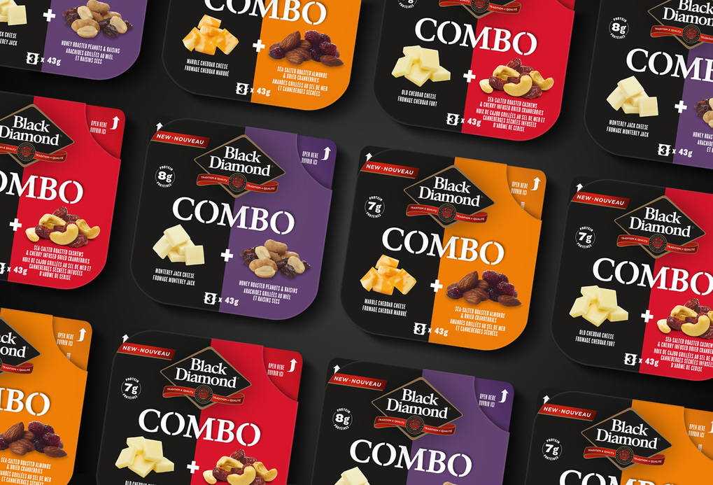
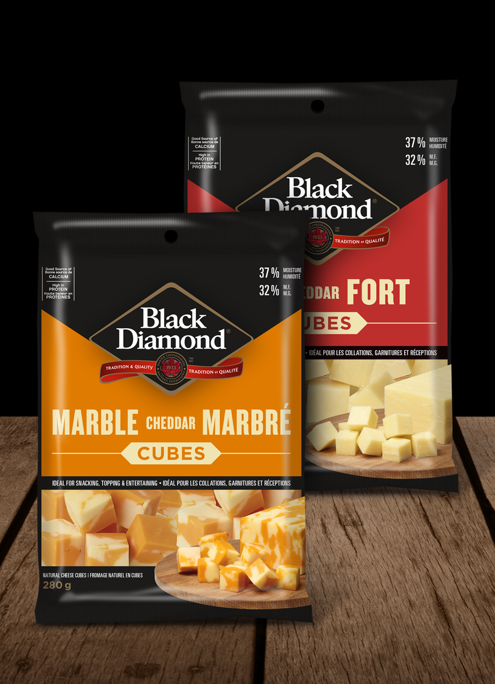
Similarly, for BLACK DIAMOND® Combo and Cubes, the latest innovations in the portfolio, package design is anchored in a brand-centric approach that leverages the high familiarity of the logo and its brand colour as key visuals. As a result, there is a strong likeness generated across the entire BLACK DIAMOND® product offering created by honouring the brand’s authentic roots.


View more related projects