With a business strategy focused on strengthening consumer engagement through product innovation, recipe improvements and premiumized offerings, an update to POM’s package design platform was required.
However, with such high levels of awareness, household penetration and consumer affection and a #1 share position at stake, there is often more risk associated with packaging changes than there is reward. As a result, research played a critical role in the development of a new package design.
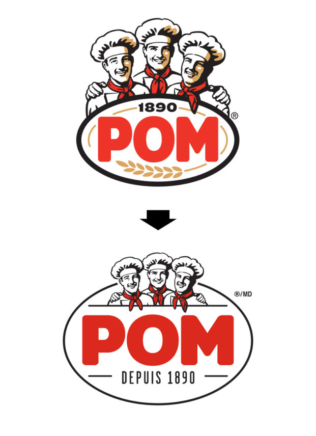
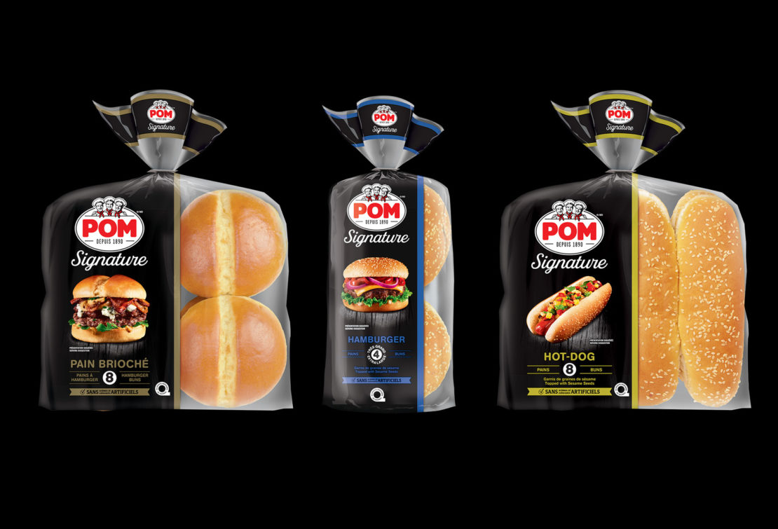
Given the brand’s popularity, brand recognition is a competitive advantage on shelf and became a critically important consideration in the redesign. Design equities of the brand – primarily the bakers and the POM wordmark – act as visual and emotional triggers for shoppers, evoking reassurance of POM’s quality and freshness and fond reminders of its unmistakable “taste of home.”
The iconic POM bakers are a valuable but delicate visual equity. While research confirms that they elicit a number of strong emotive messages (heritage, brotherhood, comradery, trusted tradition), the illustration itself was dated and its size in relation to the wordmark was not optimally proportional. As a result, a careful refresh was executed to update its style but retain its familiarity.
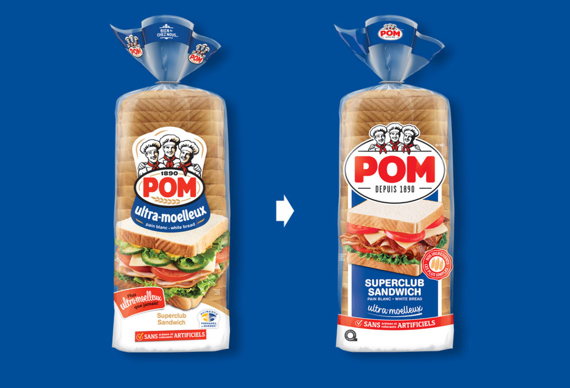
The updated baker illustration was integrated with a simplified and more contemporary POM wordmark, creating a cleaner and more visually cohesive identity.
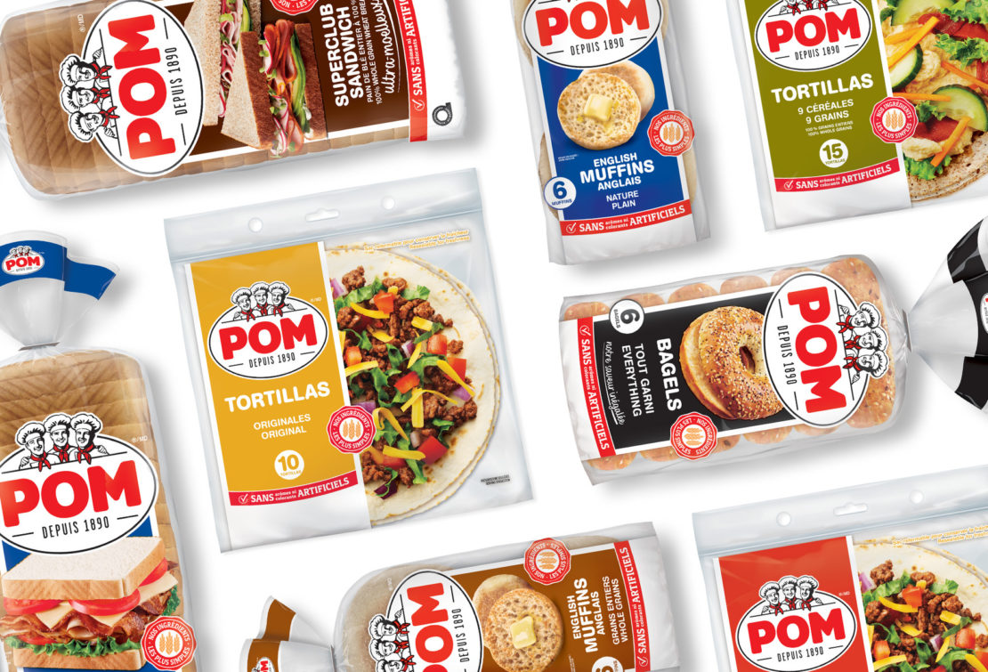
The redesign strengthens the master brand’s look by consolidating the key assets of the identity into a more uniform and more pleasing shape. This allows the logo to be significantly increased in size without compromising other communication elements, such as product shots and product features. This larger, “locked up” logo acts as a more impactful unifier across the breadth of the POM offerings in bread, buns, tortillas and bagels, thereby improving blocking and the aesthetics of the brand on shelf.
The outcome of this redesign is a bolder, more contemporary look for POM, a brand that seems to be ageless in the hearts and minds of Quebec consumers.
“BrandBourg, through its unique approach to consumer research, was able to gain the insights on how to simplify our brand platform in a way that gets us closer to the hearts of consumers while increasing shelf impact.”
Tania Goecke, Senior Marketing Director, Bimbo CanadaShare to your social media
View more related projects
 Back
Back