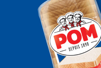
Whilst the Villaggio brand is a high performer in the Bimbo Canada portfolio, its leading SOM gap over its main competitor is relatively small. Breaking further ahead has been hindered, in part, by the Villaggio brand’s lack of distinctive and differentiating equities. In fact, consumers often confuse competitive brands due to similarities in positioning and packaging graphics. In order to realize the full potential of the brand, Villaggio’s brand positioning was expanded to encompass a broader message rather than being narrowly defined as Italian-inspired bread, prompting the need for a brand refresh and package redesign.
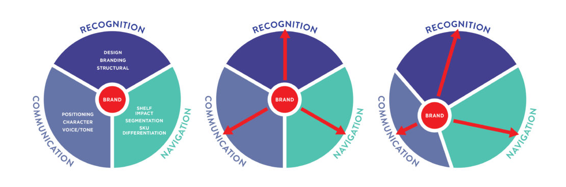
The redesign of Villaggio presented the quintessential challenge of packaging mandates. Package design plays a significant role for any brand in three key areas:
1. Brand Communication – conveying a brand’s positioning, key messages, tonality;
2. Brand Recognition – triggering impact and recognition on shelf;
3. Brand Navigation – facilitating ease of shopping experience across the product offering.
And because packaging is a static medium, these objectives are often competing against one another.
To find the optimal design that delivered on all of Villaggio’s brand and packaging redesign goals, consumer research played a vital role.
Qualitative research was conducted to help select the most promising conceptual directions as well as gain an understanding of the best execution of various design elements. BrandBourg uses “design streams” as a research stimulus tool to assess what executions are optimal solutions for addressing certain brand objectives. Respondents are exposed to several executions of a specific design component, compared to current, and probed to understanding how each influences communication.
For example, a number of logo streams (summarized below) were developed to investigate the impact that colour, illustrative style, image content, font, containment shape and copy had independently of the overall package design concept. Similarly, a design stream of different end panel layouts was researched to gain insight on how to optimize brand impact and SKU navigation.
Logo design stream developed for research. Current logo on the left.
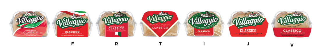
End panel design stream developed for research. Current end panel design on the left.
Once concept and design executions were optimized based on qualitative research learnings, quantitative research was used to confirm the best approach to segmentation and SKU navigation, in addition to quantifying key metrics such as brand messaging, likeability and purchase intent.
The new Villaggio brand identity embodies the brand’s new positioning. With a cleaner wordmark freed from the confinement of a containing shape, a much bolder, more contemporary identity emerges, and while it retains some key visual equities from the old logo, it truly conveys the brand’s broader new promise and passion for European-inspired breads.
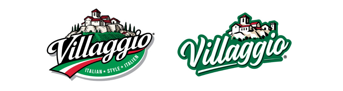
The logo, before and after
The final package design uses a combination of distinctive assets such as brand identity (recognition), iconography (quality message), colour (navigation cue) and illustration (brand story) to fully address the brand’s redesign objectives.
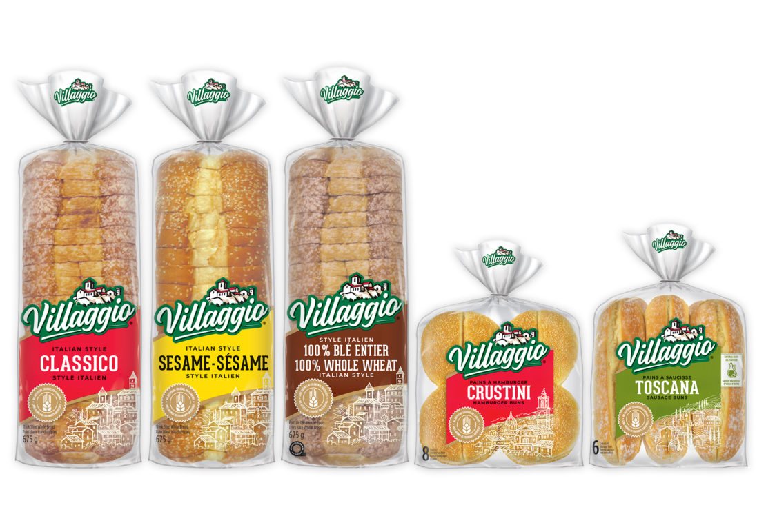
The end result is a resounding win as the new packaging passes the ultimate test of on-shelf impact and brand standout.
“The BrandBourg team brought an impressive capability to our critical project. They are highly strategic in their approach, demonstrate broad, innovative thinking in their creative development and with so much industry experience they really become a valuable and trusted partner. Our team felt confident to lean on BrandBourg in all areas of the project, including optimizing research and ensuring perfect execution in design and production art.”
– Maria Carolina Gollo, Marketing Manager, Bimbo CanadaShare to your social media
View more related projects
 Back
Back