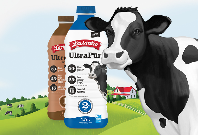
With innovation exploding in the milk category that included ultra-filtered products and new foreign (US) competitors, Lactalis responded with the launch of Lactantia UltraPur. This is the company’s maiden launch into the super-milk segment, offering consumers incredible benefits such as 50% more protein and significantly less sugar than regular milk. As a parity offering to products already in market, such as Fairlife, the brand team felt it was crucial to deliver real impact at shelf level in order to mitigate any impact of being a late entry into this segment. Brandbourg was challenged to leverage the familiar assets of the Lactantia milk packaging in order to create a bold new look that would achieve the objectives of a successful launch.
The Lactantia brand identity, widely recognized by consumers as a sign of superior quality, proudly stands out as the singular, colourful graphic element on the UltraPur bottle that conveys the pure, natural simplicity of the product contained within it. A dairy cow, which has been part of Lactantia’s visual language for decades, is brought to life as a dominant design element to clearly convey that UltraPur has all the delicious goodness of milk with 50% more protein and 25% less sugar.
Despite the significant departure from the current milk carton, the overall design architecture, use of typefaces and graphic shapes helps to retain a strong familial connection.
The result is a boldly different design that delivers impact at retail while maintaining the reassurance of Lactantia brand credentials.

Sports nutrition (protein powders, protein bars, sport drinks, etc) has experienced steady growth over the last several years and is projected to continue. While ready-to-drink protein products represent the smallest segment of the category and are dominated by large US brands (eg Muscle Milk, Core Power), Lactalis Canada believed there was an opportunity to leverage its dairy credentials and fulfill a growing consumer need for more wholesome, dairy-based, high protein RTD products.
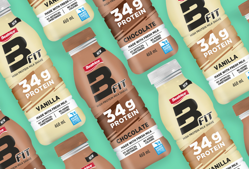
BFIT, an intrepid new product innovation for the Beatrice brand, reaches out to a new, younger target for the franchise. Made with the wholesome goodness of Canadian milk, this high protein offering targets men and women who seek healthier products to support their active lifestyle.
Commensurate with the product innovation, the package design also reflects a daring departure from the traditional Beatrice brand design.
The result is a contemporary package design that fits the visual language of the sports RTD category and a great example of courageously innovating your brand to fuel growth.
BFIT, une innovation audacieuse pour la marque Beatrice, s’adresse à une nouvelle cible plus jeune pour la franchise. Comportant tous les bienfaits du lait canadien, cette boisson riche en protéines cible les hommes et les femmes qui recherchent des produits plus sains pour soutenir leur mode de vie actif. Reflétant l’audace de l’innovation du produit, le design de l’emballage présente un virage radical par rapport à l’image traditionnelle de la marque Beatrice. Le résultat est un design d’emballage contemporain qui correspond au langage visuel de la catégorie des boissons sportives prêtes à boire et un excellent exemple d’innovation courageuse d’une marque pour en alimenter la croissance.

“We’re so excited about our milk innovations and working with BrandBourg to make them come to life. BrandBourg created unique and highly relevant branding platforms for our launches while providing the leadership necessary in ensuring the careful stewardship of our brand equities.”
Sameera Narang, Marketing Director - Innovation, Lactalis CanadaView more related projects