Reposition and (re)valorize a controlled institutional brand as a vector of pride (employer brand)
Colabor, one of the largest food distributors in the country, has been firmly established in Quebec for several decades. Its clientele consists of a variety of institutions of all sizes: schools, restaurants, hospitals, caterers, retirement homes and others.
Among the 20,000+ products distributed by the company, several hundred are under the MENU private label, whose identity has just been completely revamped by the BrandBourg team.
Colabor wanted to refresh the identity of its controlled brand for two reasons. First, it wanted to better define the brand’s personality and align it with the key elements that make up the brand: variety, quality and, above all, simplicity. The initiative was also intended to support the representatives in their mission to proudly promote and help clients discover the brand.
In short, this was a brand identity project that also had to contribute to the company’s employer brand.


Using minimalism to serve the brand
BrandBourg’s mission was to showcase the MENU brand and highlight the simplicity and convenience of its products.
To achieve this, the team relied on minimalism and familiarity: white was strongly emphasized for a refined result that contrasts with the very colourful environment usually associated with the food sector. This also allows for quick identification in an institutional environment.
When creating the concept, the team decided to opt for a typeface inspired by a familiar sight to Colabor’s clientele: menu boards, which are widely used in cafés, bistros and cafeterias. The result is simple and accessible, just like the MENU brand.
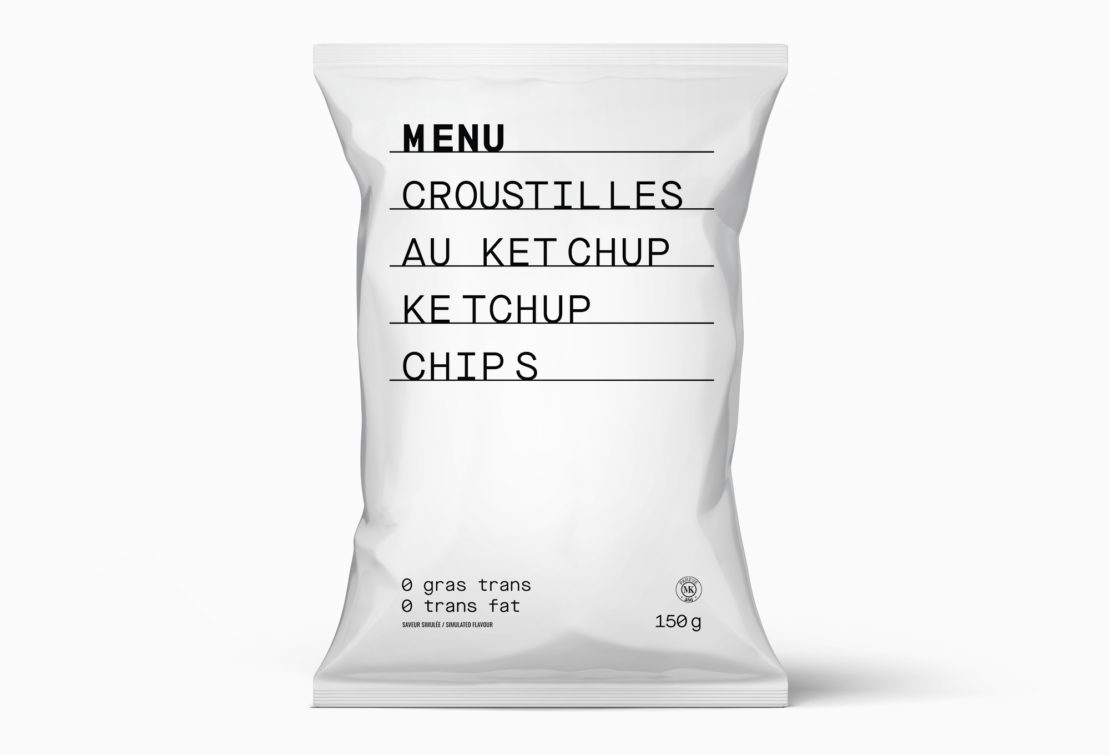
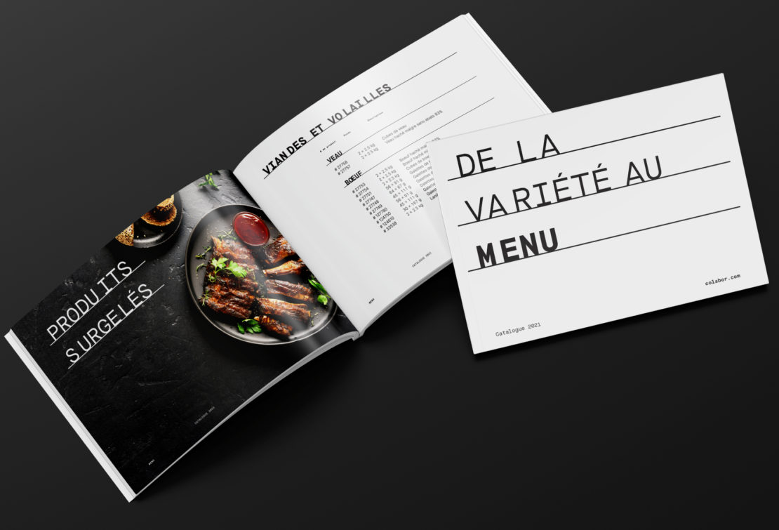
A streamlined packaging and visual platform, striking in its simplicity. With MENU, no twists, no tricks and no false promises. Just the real thing, the good stuff, at the right price.
In order to highlight the selection of high-end products, the visual platform has been declined in its reversed version: for gourmet products, black is the featured colour.


“As soon as I saw the reaction and heard the feedback from the sales team, I knew we had something very strong and distinctive. Seeing our representatives proudly wearing the new Menu hat is a clear indication of their commitment and endorsement of the new brand image.”
- Louis Frenette, President, Chief Executive Officer“The new brand image's modern, simple and clean look is definitely its most appreciated feature. Some of our clients from the fast-paced restaurant industry have mentioned that the distinctive character of the new Menu packaging makes it easier for them to find the products they are looking for, which makes their lives easier!” Mission accomplished!
- Julie Roberge, Brand Manager, Private BrandsShare to your social media
View more related projects
 Back
Back 

