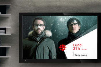
Broadsign is the world’s leading digital out-of-home signage software company allowing advertisers, agencies and media publishers to take full advantage of DOOH to communicate with their audiences across the globe. By lighting up airports, shopping malls, cinemas and other busy public places, Broadsign powers messaging at the heart of people’s lives.
The Broadsign-BrandBourg partnership started in 2017 when the company decided to revitalize its brand. From a brand that was deeply rooted in its computer engineering origins, the company wished to move on to a brand that would be more attractive to clients and prospects, as well as to its employees and future candidates. A brand that would highlight its benefits rather than its tech credentials.
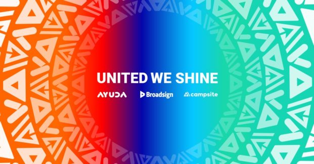
In 2019, when Broadsign doubled in size with the acquisition of Ayuda and Campsite — two Montréal-based companies with complementary products and services —, Broadsign called upon BrandBourg again to update its strategic anchors, optimize its brand architecture and mobilize its team.
A successful brand positioning depends on the participation of all internal stakeholders, and on skillful management of emotions. The key is to generate passion while keeping both feet on the ground.
Over the course of our various projects, we have implemented a variety of tools to maximize the relevance of decisions with regard to the brand, and to promote buy-in. Deep-dive interviews, surveys on the perception and satisfaction of internal and external clienteles, strategic workshops with the management team, co-creation workshops with in-house teams, all these initiatives contributed to evolving the brand towards a more coherent, more powerful version of itself.
BrandBourg’s strategists, with the guidance of Broadsign’s management, lead the reflection that brought forth the core concept of the Broadsign brand. It expresses itself through the promotion of client benefits, the redesign of the identity system and an optimized nomenclature for the brand portfolio as a whole:
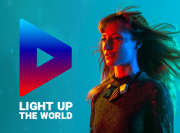
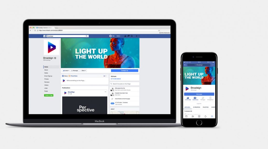
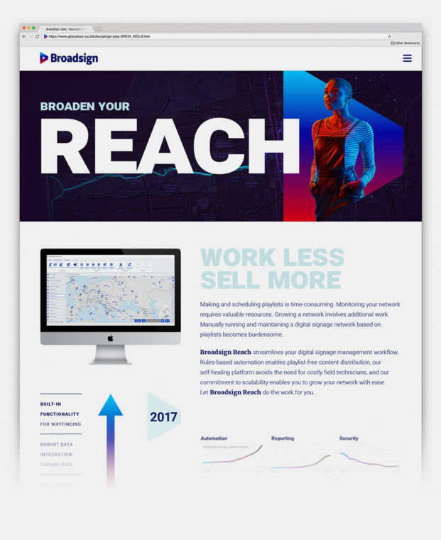
· The Light up the world signature was created to enhance the brand name, reinforce the end benefit of working with Broadsign and inspire clients.
· The new product nomenclature, based on active verbs, engages clients and helps them understand the offer.
Our creative team then started working on the logotype. To ensure an efficient transition, given that we were working with a well-known, well-appreciated brand, the most recognizable aspects of the logotype were revisited and amplified.
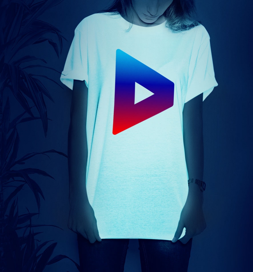
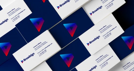
The triangle, symbolizing the “play” button of a video, was taken out of the original logotype and resized to give it its own life. It can now be used as a favicon on social media. Seen from a perspective, the symbol represents the thousands of screens that are animated on a daily basis by Broadsign.
The original blue and red were joined to cyan blue and midnight blue to create a fade-out evoking of the luminosity of digital advertising, and adds depth and energy to the icon.
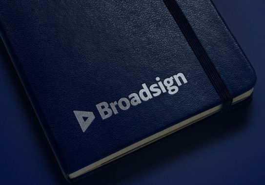
Finally, we redesigned the typography of the logotype to make it more unique.
“BrandBourg’s incredibly talented team partnered with our marketing and creative team to help build a brand strategy and identity that is both considerate of our heritage and able to take us into the next stage of our company’s growth. We are all very proud of and excited by the work.”
— Liseanne Gillham, VP Marketing, BroadsignShare to your social media
View more related projects
 Back
Back